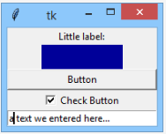
1.5 A simple GUI application
Building a GUI application from scratch
Now we're going to build a very simple and rather useless GUI application. Does that sound weird? Maybe, but the application, when ready, will make you more accustomed to some tkinter habits and conventions.
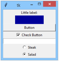
Our fabulous goal will look like the vision presented below: 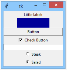
Are you ready? Let's start.
As everyone knows, Rome wasn't built in a day, and our application isn't an exception. We'll start with something absolutely obvious – we'll construct a window and launch an event controller – look at the code in the editor to see how to do it.
import tkinter as tk

window = tk.Tk()
window.mainloop()
Our window looks like this one for now: 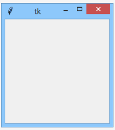
There's nothing surprising yet. Let's add something to this dull gray area.
Our new friend is called Label – a non-clickable widget able to present short textual information, passed to the widget's constructor using a text argument. The text can later be changed at any moment of the widget's life.
import tkinter as tk

window = tk.Tk()

label = tk.Label(window, text = "Little label:")
label.pack()

window.mainloop()
As you can see, we're using the pack() geometry manager to compose the window.
Let's welcome Label into our window: 
Note: pack() resizes the window to a size large enough to fit all the packed widgets. This is its default behavior. Don't worry, the window will grow soon.
Our next companion will be Frame.
A Frame is another non-clickable component used to group widgets and to separate them (visually) from other window components. Our Frame plays a less important role – it just occupies a rectangle and fills it with its own color. We expect nothing more for now.
Let's check it out.
import tkinter as tk

window = tk.Tk()

label = tk.Label(window, text="Little label:")
label.pack()

frame = tk.Frame(window, height=30, width=100, bg="#000099")
frame.pack()

window.mainloop()
This is how the Frame manifests its presence: 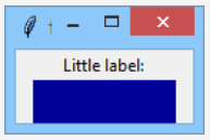
Make our window great again.
Now we invite a Button to join our team.
Our Button will be completely mute, as we haven’t bound anything to its command property. You can change that if you want.
import tkinter as tk

window = tk.Tk()

label = tk.Label(window, text="Little label:")
label.pack()

frame = tk.Frame(window, height=30, width=100, bg="#000099")
frame.pack()

button = tk.Button(window, text="Button")
button.pack(fill=tk.X)

window.mainloop()
This is what our window looks like now: 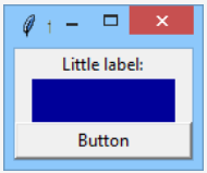
Our next component is completely invisible. You won't find it in the window area.
import tkinter as tk

window = tk.Tk()

label = tk.Label(window, text="Little label:")
label.pack()

frame = tk.Frame(window, height=30, width=100, bg="#000099")
frame.pack()

button = tk.Button(window, text="Button")
button.pack(fill=tk.X)

switch = tk.IntVar()
switch.set(1)

window.mainloop()
It's the switch variable. Can't you see it? It's set to hold an object of the IntVar class. This object is designed to store integer values. «Okay,» you may say, «can't we use a regular variable instead?»
No, we can't. Objects of the IntVar class are used by tkinter to organize internal communication between different widgets. A regular variable can't play such a role.
If you want such an object to store an integer value, you can't use the assignment operator. The class offers a dedicated method for that purpose, and the method is named set().
Note: we've used the method to store a value of 1 inside the object.
As the window's view hasn't changed, we can go directly to the next step.
The next step adds a brand new widget to our window – it’s a Checkbutton.
It’s a small square which can be filled with a tick mark, or which can be empty.
import tkinter as tk

win = tk.Tk()

label = tk.Label(win, text="Little label:")
label.pack()

frame = tk.Frame(win, height=30, width=100, bg="#000099")
frame.pack()

button = tk.Button(win, text="Button")
button.pack(fill=tk.X)

switch = tk.IntVar()
switch.set(1)

checkbutton = tk.Checkbutton(win, text="Check Button", variable=switch)
checkbutton.pack()

win.mainloop()
The Checkbutton is primarily used to represent two-state selections. In other words, it can be in one of two possible states:
- the ON state when the
Checkbuttonis checked/ticked (which can be equated with an affirmative answer to some question) - the OFF state when the
Checkbuttonis cleared (you can think of it as a kind of negative answer)
Take a look at the Checkbutton constructor – there’s something completely new. Can you see it?
Yes, it’s a variable argument. Note – it’s set to the previously created switch object. The assignment creates a bidirectional link between the object and the widget. How does it work?
- If you check or uncheck the
Checkbutton, the switch object will immediately change its state – it will keep 0 if the widget is unchecked, and 1 otherwise. - If you change the state of the
switchobject, theCheckbuttonwill immediately reflect the change – it means that you don’t need to access theCheckbuttonitself to check/uncheck it, as you can modify theswitchvalue instead.
Look, the switch is initially set to 1. this means that the Checkbutton will be checked when it appears on the screen.
Let's check it.
This is what our window looks like now: 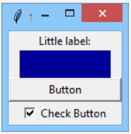
Okay, it definitely looks as expected, but how can we be sure that the switch object changes its state according to our clicks addressed to the Checkbutton?
We’ll show you soon. Stay tuned.
Now we add a very important, and internally an extremely complicated, widget, named Entry. Look at the code in the editor.
import tkinter as tk

window = tk.Tk()

label = tk.Label(window, text="Little label:")
label.pack()

frame = tk.Frame(window, height=30, width=100, bg="#000099")
frame.pack()

button = tk.Button(window, text="Button")
button.pack(fill=tk.X)

switch = tk.IntVar()
switch.set(1)

checkbutton = tk.Checkbutton(window, text="Check Button", variable=switch)
checkbutton.pack()

entry = tk.Entry(window, width=30)
entry.pack()

window.mainloop()
Entry is designed to let the user enter simple, one-line data, like single numbers, names, addresses, etc.
We’ve added one to our window. It creates an input field 30 characters wide. You can play with it if you want, but it’s completely inoperative as far. We only want to show you what it looks like.
Isn’t our window lovely?
We’ve added two widgets at once – look!
These are the Radiobuttons, small circles filled with a dot, or not. The most important difference between Check- and Radiobuttons lies in the fact that Checkbuttons are solitary (they work individually) while Radiobuttons always work in groups and – note it! – only one of the widgets inside the group can be checked. Clicking an unchecked member of the group will cause the currently checked Radiobutton to change its state.
How do we achieve such an effect? The switch object will help us with it.
>import tkinter as tk

window = tk.Tk()

label = tk.Label(window, text="Little label:")
label.pack()

frame = tk.Frame(window, height=30, width=100, bg="#000099")
frame.pack()

button = tk.Button(window, text ="Button")
button.pack(fill=tk.X)

switch = tk.IntVar()
switch.set(1)

checkbutton = tk.Checkbutton(window, text="Check Button", variable=switch)
checkbutton.pack()

entry = tk.Entry(window, width=30)
entry.pack()

radiobutton_1 = tk.Radiobutton(window, text="Steak", variable=switch, value=0)
radiobutton_1.pack()
radiobutton_2 = tk.Radiobutton(window, text="Salad", variable=switch, value=1)
radiobutton_2.pack()

window.mainloop()
Our two Radiobutton constructors use two additional arguments. What roles do they play?
- The
variableargument binds aswitchobject to both of the widgets, and this is the clue – the fact that both Radiobuttons are bound to the same object creates the group. Don’t forget that! - The
valueargument distinguishes theRadiobuttonsinside the group, and thus each of theRadiobuttonshas to use a different value (we’ve used0and1)
The communication through the switch object should work as follows:
- selecting one of the
Radiobuttonsaffects theswitchobject, which changes its value to one of the possible values specified in theRadiobuttons’ constructor; note: the mechanism works in the same way if there are moreRadiobuttonsin the group; - simultaneously, changing the
switchobject’s state affects theRadiobuttongroup.
As the switch is initially set to 1, we expect the second Radiobutton (named Salad) to be selected when the application starts.
Do you want to check it? Go ahead!
We hope we’ve lived up to your expectations:
There is something more you should note. As the Checkbutton and Radiobutton groups are coupled together by the switch object, their changes are synchronized.
Check this carefully!
If you check/uncheck the Checkbutton, the Radiobutton group will follow the change immediately and vice versa, while switching the active Radiobutton inside the group will automatically check/uncheck the Checkbutton.
Now you’re ready to dive deeper into tkinter.
Let’s dive together.
Okay, let’s provide some serious work to our switch object.
