1.7 Visiting widgets’ properties
Widget properties
As you already know, every widget has a set of properties, and the widget’s user is able to change them by modifying the widget’s appearance and behavior. We’ll show you how to manipulate properties and present a basic set of the most usable widget properties.
A widget's property is not just an object property. Although every widget is actually an object, you can access its properties by using the dot notation. You have to use one of two possible ways of reading and setting widget properties’ values.
The first method is based on using a dictionary which exists inside every widget. Assuming that a widget named Widget has a property named prop and you want to read its value and then set it with a new value, you can do this in the following way:
old_val = Widget["prop"]

Widget["prop"] = new_val
Let’s see it in action. Look at the example we've provided in the editor.
import tkinter as tk


def on_off():
    global button
    state = button["text"]
    if state == "ON":
        state = "OFF"
    else:
        state = "ON"
    button["text"] = state


window = tk.Tk()
button = tk.Button(window, text="OFF", command=on_off)
button.place(x=50, y=100, width=100)
window.mainloop()
Note: we use the text property to:
- diagnose the current button’s state;
- change the button’s state to the contrary one;
- update the button’s title.
Run the code and observe its behavior.
The second method relies on two specialized widget methods, the first named cget() designed to read the property’s value, and the second named config(), which allows you to set a new value to the property.
This is what they look like:
old_val = Widget.cget("prop")

Widget.config(prop=new_val)
Let’s rewrite our code to use this way of communicating with the widget’s properties.
Look at the code in the editor.
import tkinter as tk


def on_off():
    global button
    state = button.cget("text")
    if state == "ON":
        state = "OFF"
    else:
        state = "ON"
    button.config(text=state)


window = tk.Tk()
button = tk.Button(window, text="OFF", command=on_off)
button.place(x=50, y=100, width=100)
window.mainloop()
Check carefully if it behaves the same way as the previous snippet.
One of the properties we want to tell you about is font. Every widget presenting a piece of text (e.g., Button and Label but not Frame) can be made to use a font different from the default.
Tkinter represents fonts as tuples. Surprised? Don’t be, it’s very simple.
Any font can be described as two- or three-element tuples:
("font_family_name", "font_size")

("font_family_name", "font_size", "font_style")
- the two-element tuple contains two strings: the first containing the font’s family name, and the second carrying the font’s size measured in points; note: the second element has to be a string, although it specifies strictly numerical information;
- the three-element tuple uses the third string to specify the font’s style, which can be expressed using the following strings:
- «bold»
- «italic»
- «underline»
- «overstrike»
Do you want to see it in action? Of course you do!
The property responsible for storing font information is – obviously – named font.
We’ve used the Label widget to demonstrate three different fonts. Look at the code in the editor.
import tkinter as tk


window = tk.Tk()
label_1 = tk.Label(window, text="Quick brown fox jumps over the lazy dog")
label_1.grid(column=0, row=0)
label_2 = tk.Label(window, text="Quick brown fox jumps over the lazy dog", font=("Times", "12"))
label_2.grid(column=0, row=1)
label_3 = tk.Label(window, text="Quick brown fox jumps over the lazy dog", font=("Arial", "16", "bold"))
label_3.grid(column=0, row=2)
window.mainloop()
Expand it to display some more fonts, including your favorite ones.
Our fonts look like this:
Every widget occupies a part of the window’s area, thus it’s obvious the widgets must have sizes. Interestingly, widgets have properties describing many more sizes than just width (usually specified in pixels) and height (which can be specified in rows of text if the widget is able to present textual information).
The list of widget sizes is gathered in the table:
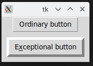
The example in the editor shows how some of the sizes work.
import tkinter as tk


window = tk.Tk()
button_1 = tk.Button(window, text="Ordinary button");
button_1.pack()
button_2 = tk.Button(window, text="Exceptional button")
button_2.pack()
button_2["borderwidth"] = 10
button_2["highlightthickness"] = 10
button_2["padx"] = 10
button_2["pady"] = 5
button_2["underline"] = 1
window.mainloop()
This is what we see on our screen: 
You already know the three alternative methods used to describe the colors. Now we’ll show you which parts of the widget can be colorized. There are more options than you may suspect: 
Let’s colorize a button – look at the code in the editor, this is how we’ve done it.
import tkinter as tk

window = tk.Tk()
button_1 = tk.Button(window, text="Ordinary button");
button_1.pack()
button_2 = tk.Button(window, text="Colorful button")
button_2.pack()
button_2.config(bg ="#000000")
button_2.config(fg ="yellow")
button_2.config(activeforeground ="#FF0000")
button_2.config(activebackground ="green")
window.mainloop()
And this is what it looks like in both inactive and active states: 
You don't like the colors? Feel free to experiment with the colors of the font, foreground, and background to make the button look more attractive.
Our next widget is an anchor. Don’t worry, we aren’t going to take you out to sea. We’ll stay on dry land, we promise. The anchor is an imaginary (invisible) point inside the widget to which the text (if any) is anchored. As you’ve probably noticed, widgets tend to put their text in the middle of themselves (both in horizontal and vertical directions). The location of the anchor can easily be changed, as there is a property of the same name.
It seems to be obvious, but there’s one unobvious aspect – how to name the anchors.
This is done by a set of predefined identifiers which make of use of the compass coordinates – take a look and everything will be clear at once: 
As you can see, there are nine anchors, and the one placed in the middle is named CENTER (not a very compassey name, we admit). The CENTER anchor is the default one and is used when you don’t set the anchor property at all.
Let’s do some tests.
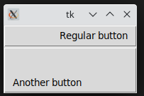
Look at the code in the editor. We’ve used two buttons to show two non-default anchors – we hope you’ll continue our experiments on your own.
import tkinter as tk

window = tk.Tk()
button_1 = tk.Button(window, text="Regular button");
button_1["anchor"] = "e"
button_1["width"] = 20  # pixels!
button_1.pack()
button_2 = tk.Button(window, text="Another button")
button_2["anchor"] = "sw"
button_2["width"] = 20
button_2["height"] = 3  # rows
button_2.pack()
window.mainloop()
Our buttons look as follows – and yours? 
Our next property is the cursor.
As you know, the default mouse cursor reveals itself as an arrow. Sometimes, when it enters a specific area, its shape can change (e.g., over input fields).
You have the power to order the cursor to change to a different cursor over each of the widgets, as every widget has the property we’re talking about.
Unfortunately, the repertoire of available cursors isn’t very impressive – all of them are described here.
We’ll show you three of them. Feel free to test all the rest. Don’t forget to move the cursor over the frames. You won’t see anything interesting without doing that.
import tkinter as tk

window = tk.Tk()
label_1 = tk.Label(window, height=3, text="arrow", cursor="arrow")
label_1.pack()
label_2 = tk.Label(window, height=3, text="clock", cursor="clock")
label_2.pack()
label_3 = tk.Label(window, height=3, text="heart", cursor="heart")
label_3.pack()
window.mainloop()
Okay. Now we’re ready to show you some of the widget methods. You’re familiar with some of them already. See you soon!

